‘Pay it with Paze’
Brand & Campaign Identity
A campaign heralding the future of online payments.


Paze is a new digital wallet that seamlessly aggregates your credit and debit cards from various institutions for swift online checkouts. To reach its audience of modern customers, the launch campaign spotlights three key aspects of online shopping:
Desire (What we buy)
From colorful everyday items to cutting-edge gadgets, the campaign showcases a range of coveted items to tap into consumer desires.
Online shopping allure (How we buy)
The campaign leverages the allure of online shopping through the use of graphic elements, inspired by digital checkout experiences.
Emotional satisfaction (Why do we buy)
Be it a dreamlike experience in pre-vacation booking or a wide smile securing concert tickets, the campaign highlights the emotional satisfaction of purchasing, evoking accomplishment and joy.
Refreshingly simple.
The identity system was thoughtfully designed with a minimalist approach, ensuring that every element serves a clear purpose. As a result, the campaign embodies a modern and future-oriented aesthetic, striking a balance between a contemporary look without being trendy.
The brand exudes energy and positivity by using a custom typeface accompanied by saturated colors, a complete icon suite, and bespoke photography, reflecting the dynamic nature of Paze's financial interactions.

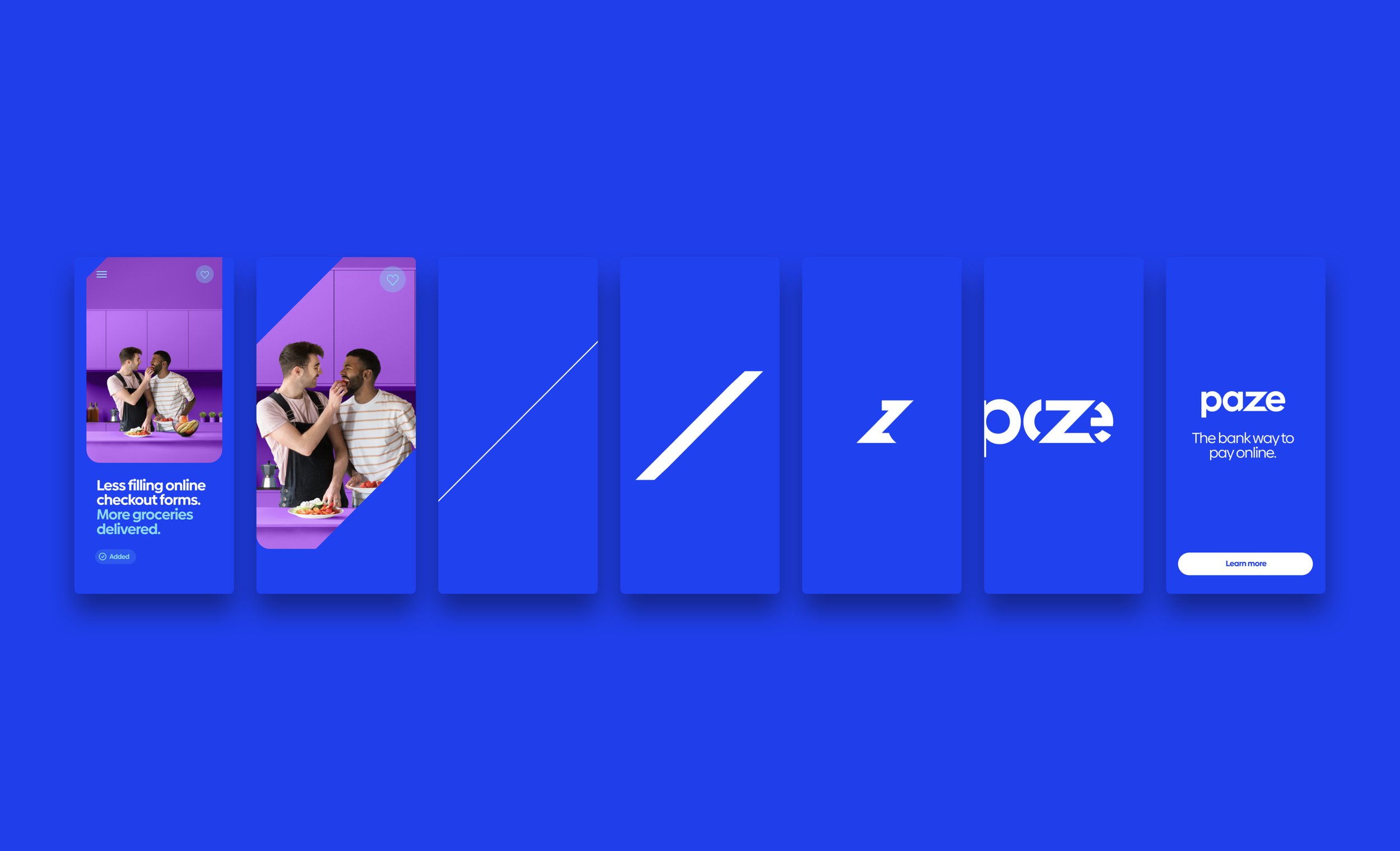
The Paze logo, designed in a simple, lowercase style.

Paze's custom typeface features a unique lowercase "z" that aligns with the logo's corners when followed by a round letter. Additionally, certain characters have terminals designed at a 45-degree angle, mirroring the angle of the "z" in the Paze logo.

The system introduces a rich color palette for UI elements and photo backgrounds.

Inspired by the Paze logo, the iconography system combines rounded corners, sharp edges and open gaps to create a dynamic icon gallery.
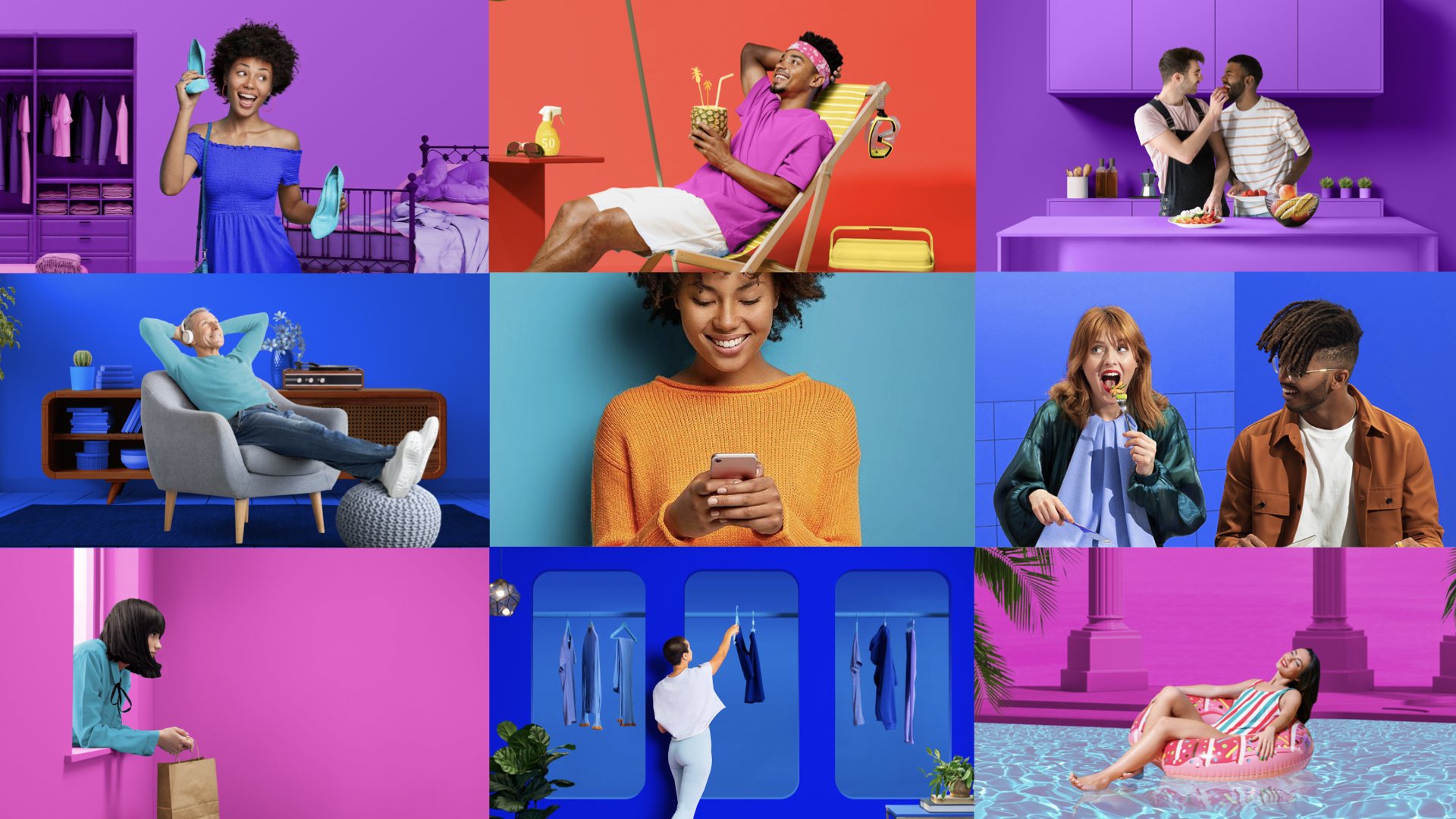
Photography showcases worlds the audience can see themselves in while remaining open to imagination and possibilities. This is achieved through solid uses of Paze brand colors within a more illustrative and studio setting. Additional natural colored props create situational context and help make each scene feel more natural.
Brand-focused templates.
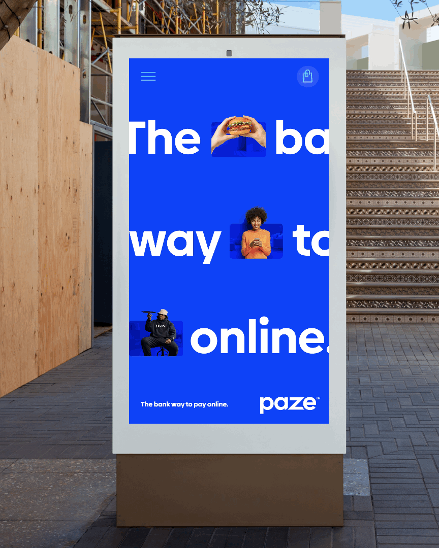
Brand templates were exclusively designed to deliver high-level, brand-focused messaging. The pieces mix Paze Core Blue color for all backgrounds with iconography inspired by the checkout experience and photography showcasing individual consumers and their objects of desire.


RTB templates.
The RTB campaign pieces focus on consumer benefits, & merchant-specific messaging. To help convey this message, the templates provide longer headlines, sub-copy, and generous space for colorful images showcasing post-transaction moments. User interface (UI) elements connect to digital shopping and checkout experiences.


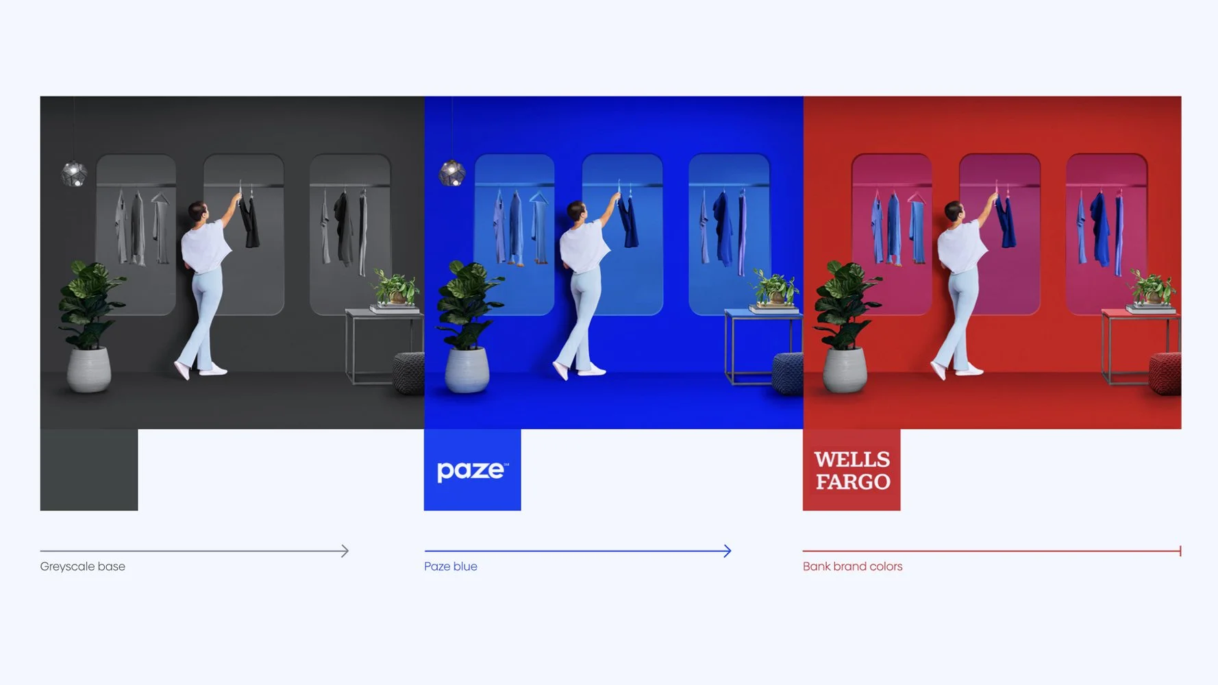
Bank-led templates.
As banks introduced Paze to their customers, it needed to be clear that the promotion was from the bank and not a third party.
With this in mind, a lockup system was created, using a 45-degree angle 'pocket,' where simplified bank cards representing each of the founding banks are visually "stored" in Paze's. This bank card lockup reinforces the role of Paze as a trusted bank wallet.
The bank template system uses dedicated areas to display bank-branded imagery and messaging, combined with “the pocket” as a graphic device to connect Paze and its financial partners.

Every bank is encouraged to represent the vibrant and imaginative world of e-commerce of Paze through lifestyle and desirable objects, applying their color schemes and showcasing subjects that match their photography style.


My role & contribution
There were many reasons why I enjoyed working on this project. First, the client decided to develop their brand and campaign work based on a design direction I established in the pitch work, which is fantastic. Also, I was lucky enough to work with a small but highly seasoned team, which allowed me to divide and conquer to produce comprehensive design exploration.
Direction
Harry Garcia / EDD
Cory Galster / GDD
Design
Harry Garcia
Cory Galster
Ana Kim
Warren Teo
Sydney Tomer
Animation
Ana Kim
Harry Garcia
Photo Retouch
Dylan Boye