‘Kind Design’
Brand Identity, Digital Design
A system designed to bring peace of mind, empathy and civility back to the travel experience.

From the time the first JetBlue plane hit the runway, the brand set out to be the most caring travel provider in the world. With that goal in mind, they needed a little help evolving that mindset for the digital space to show how it can fundamentally change how their customers purchase travel.
Color & Type
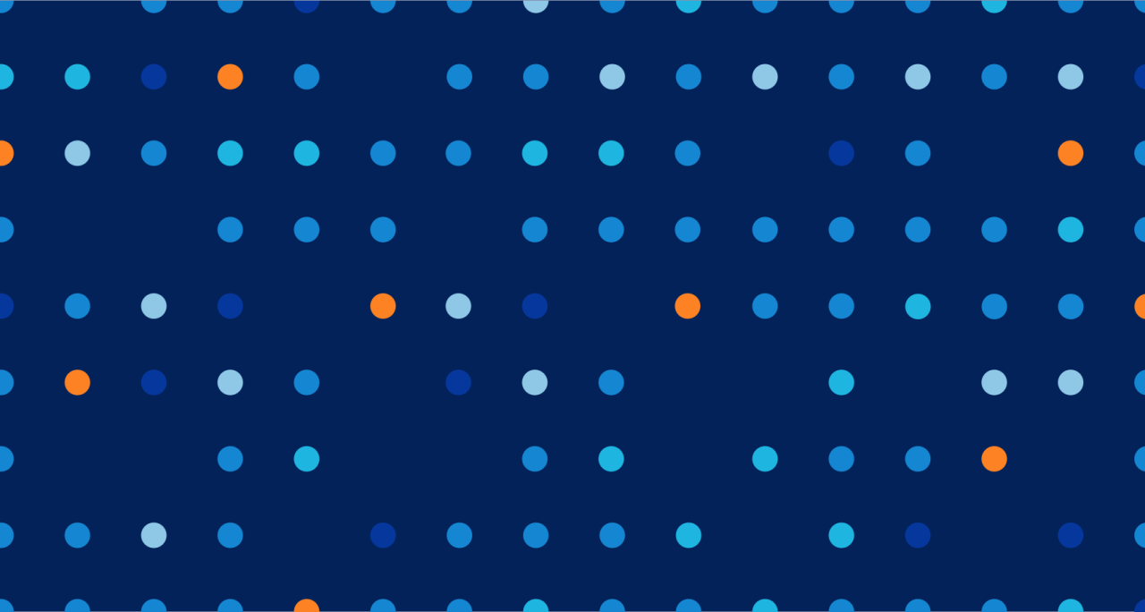
The new brand palette has a broad combination of colors to reflect Jetblue’s friendly energy and celebrate the joy of travel. Dark blues dominate the color system to help maintain legibility and accessibility, while orange and green are reserved for high-impact branded moments. Secondary, lighter colors are used on illustrations, graphic motifs, highlights, and nonessential elements.
When it came to typography, emphasis was given to using sentence cases to foster a sense of approachability and empathy, making the communication of messages and content feel more human and relatable to users.
Happy patterns.
The legendary graphic patterns developed for the jet tails are central to the new digital brand system. JetBlue's brand tone is surprisingly playful and non-alienating, using these abstract graphic patterns with gentle and simple shapes. Unlike traditional travel photography that may feel exclusive or distant, these abstract patterns evoke a sense of inclusivity and approachability.
The pattern’s pronounced geometric shapes informed many of the components in the design system: from section backgrounds, buttons, cards, and labels to promotional pieces.


Component design inspired by JetBlue graphic patterns
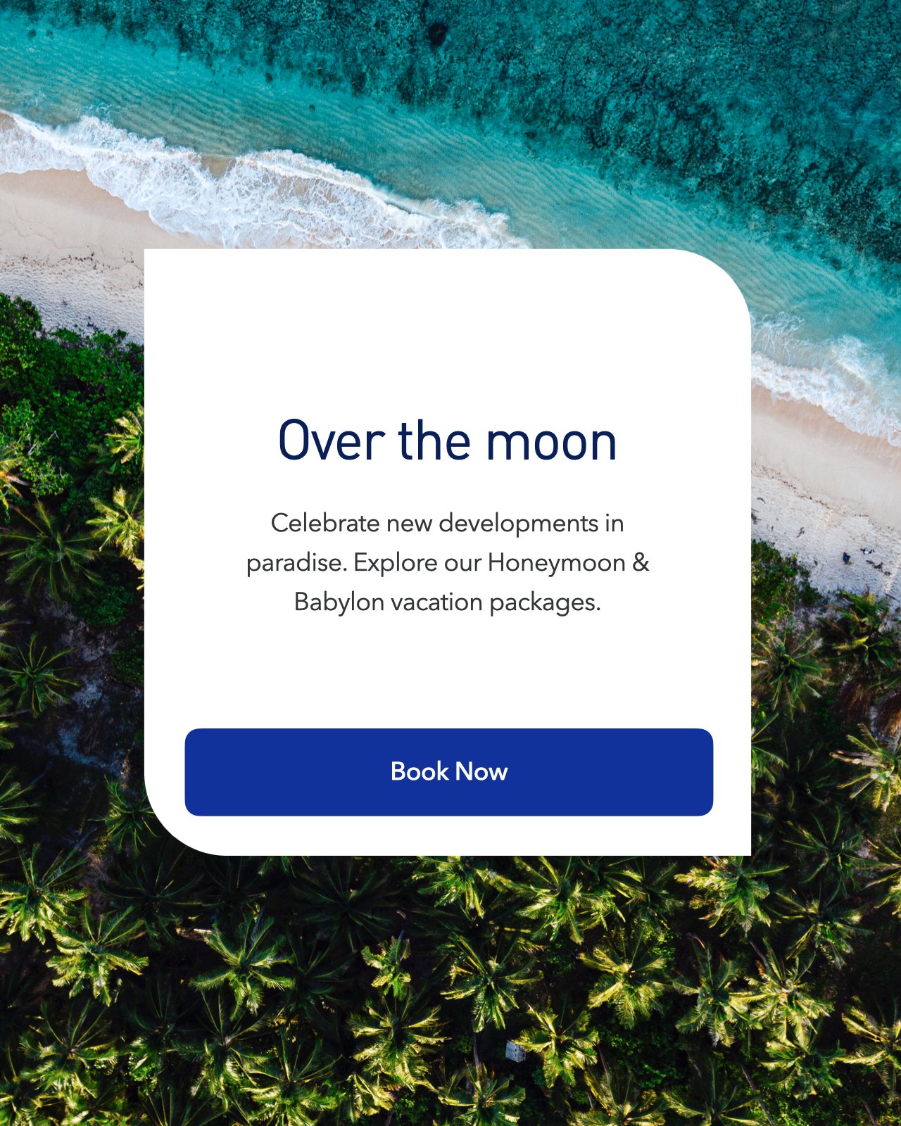
Asymmetric promotional component
Say it without saying it.
A new collection of icons was created to help viewers find their way quickly and efficiently. Because of their simplicity, icons help eliminate language barriers, an essential consideration for Jetblue’s diversity of travelers.
The playful style, equally inspired by the Jetblue graphic patterns, helps establish a memorable brand identity and captures the brand's fun, witty, caring aspects.


Playful & chic.
With kindness and consideration thoughtfully integrated into the entire design system, every touchpoint with the brand becomes a meaningful interaction. The end result is a fresh and distinct product offering that sets Jetblue apart from its competitors, known for their unempathetic and impersonal approach. The playful-yet-stylish design system conveys wit and attention to detail, leaving a lasting impression on travelers and attracting new customers seeking a more human-centered flying experience.

Flight results with peace of mind.
The new booking flow sought to bring peace of mind, clarity, and simplicity to purchasing travel. A simplified user experience allows the customer to stay on track and reduce decision paralysis.
Due to the distinct nature of JetBlue's fare classes, which offer unique amenities and benefits, the seat selection experience was crucial in educating travelers and helping them make confident decisions. The new experience incorporated a clear visual representation of each fare class combining shapes and colors, personalized recommendations, and educational slide-in panels with photography.

Delivering confidence on the day of traveling.
JetBlue's 'Kind Design' philosophy truly shines on the day of traveling, one of the most stressful days for any traveler, by giving users the control they need to navigate their journey seamlessly.
A personalized hand-holding experience: Whether it's a reminder to check-in, a weather update, or baggage claim details, an in-app Day Of Travel’ feature delivers a highly visual experience with notifications cater to individual travelers' needs, providing relevant information that keeps them informed and confident throughout their journey.
In-flight screen experience: a fresh and welcoming interface was proposed to promote easy access to entertainment options, flight information, and amenities. Empathetic messaging and witty graphic elements ensure passengers feel seen, engaged, and informed throughout their journey.

The new digital kiosk design empowers travelers to manage their travel preferences independently.
JetBlue's design system for travelers navigating the airport incorporates clear and well-designed wayfinding signage.
Time to share.
Finally, JetBlue's colorful graphic patterns were skillfully employed to inspire a series of attention-grabbing social media campaign posts on Instagram. Using bold and abstract features, the images showcased some of the most popular JetBlue destinations, sparking intrigue and excitement among users.
From captivating drone-like views to creatively cropped images, these visually striking posts invite users to decipher and explore the allure of these exciting destinations, enticing them to engage with the brand and fueling their desire to embark on their own JetBlue adventure.


My role & contribution
If you thought, 'there's no way only one person could've designed all this work,' you're 100% right. This is a highly distilled design story of a five-year engagement with Jetblue, which required an entire group of exceptionally talented individuals. I was lucky to help establish the design vision, lead and direct this work, and roll up my sleeves and design pieces with my team. The list is long. I'm sure I'll miss some names.
Direction
Harry Garcia / EDD
Dave Chau / GDD
Jared Bell / DD
Heather Harrigan / EUXD
Iris Mas / EUXD
Anna Farrell / UXD
Chris Huban / ECD
Design
Harry Garcia
Mark Edwards
Brandon Shefton
Cesar Corpus
Sharon Lin
Kiri Coles
Annie Zeng
User Experience
Ashton Vazquez O’Connor
Abby Mills
Noah Deutsch
Syed Lagoon
Victoria Honey
Tom Hammer
Animation
Harry Garcia
Cez Corpus
Dave Chau
Kiri Coles
Annie Zeng