Project Emerald
Thematic exploration, Design Study
Thematic exploration of one of the world’s most prestigious credit card.

In 2022, Chase embarked on a mission to conceive an exclusive credit card capable of standing tall amongst the industry's most esteemed counterparts. They acknowledged the card's triumph hinged on its financial advantages and providing access to exceptional lifestyle experiences: high-end traveling and the world's most exclusive retail, entertainment, and food experiences. Chase undertook a comprehensive design process to convey this, including crafting creative themes, choosing names, and visual exploration to capture the essence of their new elite offering.
Below is an excerpt from this exploration that highlights two themes and their corresponding card names.
Theme One
‘Abstract Legacy.’
Chase has a rich history of timeless innovations. From creating one of the first financial abstract logos to Art at Work, Chase’s exclusive art collection, they have been at the forefront of progress while remaining true to their legacy.
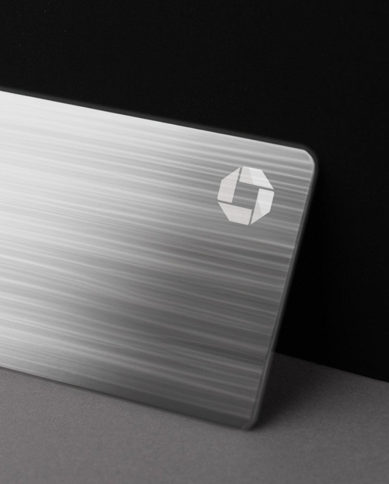
THE CHASE 8 CARD —The designer of the iconic Chase Octagon logo set out to create a symbol that would withstand the test of time. The sleek, eight-sided shape links equal parts in perfect symmetry, suggesting that progress originates from unity. To this day, the number eight is entrenched in many cultures as a symbol of strength and prosperity.

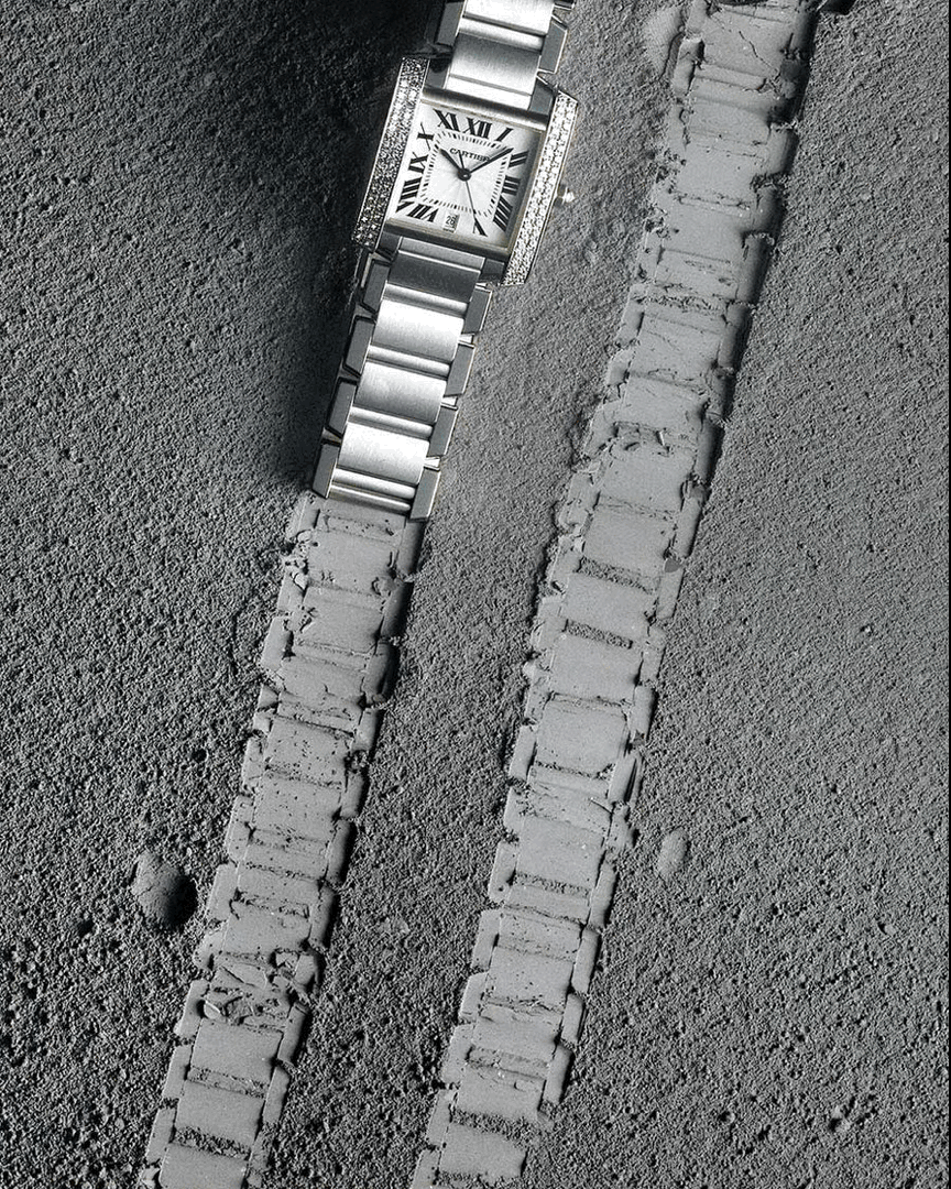
Mineral Palette.
Mineral colors, organic materials and brushed metal finishes project raw sophistication and elegance in design. Its link with strong precious materials conveys strength, legacy, and timelessness.

Tactile Quality.
The use of specialty materials, such as leatherette, soft-touch premium tissue paper, and other tactile cues promote luxury values and aligns with the firm's embrace of creativity and excellence as core business principles and priorities.

Art Influenced.
The use of artistic design styles and treatments reflect Chase’s rich history in corporate art collecting while enhancing consumers’ perceived prestige value.

BLACK CARBON— Beyond a distinct aesthetic design, a solid titanium card reinforced with carbon fiber polymer aims to develop the most durable credit card ever made, with high impact, extreme temperatures, and corrosion resistance.

SKELETAL— A solid metal body and a precisely machined die-cut make this card design a true one-of-a-kind, offering a sturdy and lightweight design.

ASYMMETRIC—Inspired by the Chase Octagon, this card design breaks traditional card design conventions using angled trims and a monolithic solid gold finish.

RAW BEAUTY—This design made of a true amalgam of dark marble and gold fillings makes for a robust, unique, and hefty card that promises a lasting impression.


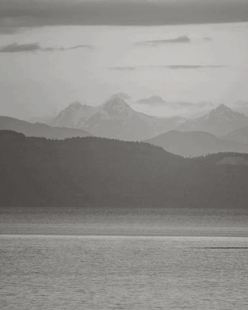
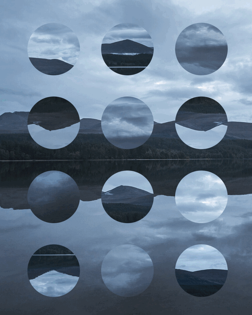
Visual Space.
This world inherits both the past and present. The photography explores the visual tension between Chase’s rich past and future. It combines elements like gold, glass, concrete and sand with strong lines, confident typography and clean graphics.
It’s muted, yet warm and refined.
It’s classic, yet avant-garde.
It’s natural, yet strong.


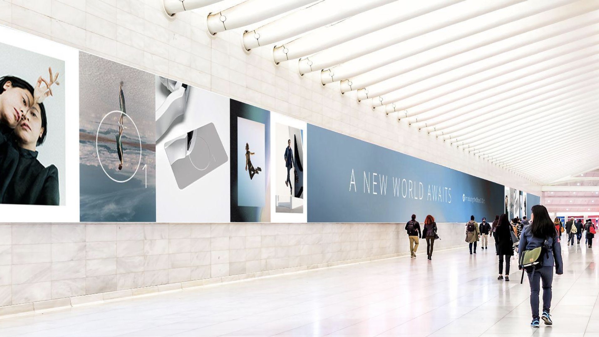
Theme Two
‘World of Elevation.’
A dreamlike, atmospheric state of being that symbolizes an elevated place where one breathes their own kind of air.
THE CHASE O1 CARD— Luxury today is about experiences over objects. When one has reached this level, the views are magnificent, the air is rarefied, and the world is open. O is the atomic symbol for oxygen and represents the simplest expression of the arrival to exceptional.

A fused palette.
The atmospheric nature of this visual direction can be expressed by fusing vivid abstract gradients that emulate the ever-changing nature of light in the sky.

Absolute reflection.
‘World of Elevation’ represents a new dimension of luxury beyond objects and materialism. We can create a sense of depth by translating the effects of physical reflection using highly reflective metals.

Dimension.
Holographic textures can be employed to infuse a futuristic and visually captivating dimensionality.
SOLID ETHEREAL— This card features overtly smooth brushed lines that artfully mimic the fluidity and grace of the wind, evoking a sense of ethereal prestige.

PATTERNS— This design employs a captivating holographic treatment, incorporating intricate graphic patterns of Chase's emblem, lending an aura of unattainable allure and sophistication to the card.

THE PORTAL— Crafted from a single piece of gleaming platinum with a 100% reflective surface, this card creates the illusion of a portal to a different dimension, embodying an unparalleled level of prestige and exclusivity.

Visual Space.
The photography strikes the balance between rich textures and weightless etherealism. A mixture of black, white photography and a brightly lit palette grounds us in the brand world and elevates the senses.
It’s a state of mind more than a place.
A portal to somewhere beyond.


My role & contribution
I was responsible for both design directions and the execution of many of the proof of concept pieces in this case and thematic designs for all previous names and territories (and believe me, there were many!).
This thematic exploration took several months, and the entire brand positioning and naming exercise required a large team, many of whom I didn't have the chance to collaborate with directly, so unfortunately, I don't have all the names and role titles. However, I was pleased to collaborate with a solid group of creatives for the design phase.
Direction
Harry Garcia / EDD
Steve Street / ECD
Dorothy Austin / CD
Ryan Schira / Account+PM
Design
Harry Garcia
Cole Spiess